Penmachine
24 October 2009
What would you do for a Klondike bear?
A couple of weeks ago, my wife Air pointed out to me that the sidewalks in front of convenience stores throughout Greater Vancouver have recently sprouted large, inflatable polar bears promoting Klondike ice cream bars:
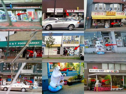
The Klondike promotions rep was obviously very busy around Vancouver in October. Both Air and I like the inflatable bears—they're cute, and large, and strange. Most effectively, they point out how many independent mom-and-pop style corner stores there still are in this city. I'm often tempted to assume that most have been put out of business by 7-Eleven and gas station shops, but that appears not to be the case.
My set of nine photos above resulted from my simply keeping an eye out for the bears during a couple of car trips on a single day this past week. Most of the pictures are from just one street, the main inter-city artery Kingsway. There must be dozens or hundreds of the beasts throughout the region.
One I didn't manage to snap is probably breaking the rules. On Canada Way, there's an independent Buffalo gas station that has covered the Klondike logo with a sign reading "HAND CAR WASH." That promo rep might be angry if he or she spots it.
Labels: animals, food, humour, shopping, signs, vancouver
24 April 2009
The neighbourhood of weird signs
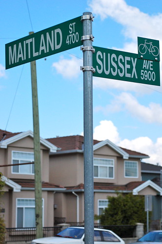
Most of the street-name signs in Burnaby, the Vancouver suburb where I live, are the standard metal stick-out-from-the-post type, like this one:
However, a couple of decades ago, just up the block from us, the city installed this one, entirely vertical in design and mounted on a girder rather than a post. And I haven't seen another like it anywhere in Greater Vancouver:
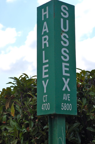
It's not genuinely bizarre—it's still white on green, and if all the signs were like that, things would work just fine. I just wonder why it's different from all the rest. (UPDATE: In the comments, visitor RentingSucks provides the explanation, which is funny, and logical.)
Across the street from those two is this masterpiece, which I still consider the most confusing road sign ever:
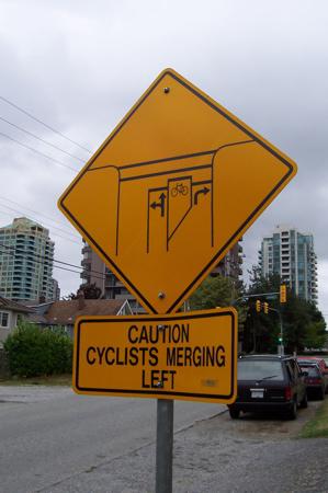
Maybe there's a secret road sign experimentation division down by Burnaby City Hall that I don't know about, and our street is its main lab.
Labels: design, signs, vancouver
14 August 2007
Why isn't the Clearview typeface free?
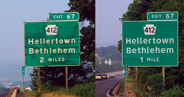 Via John Gruber, here's a neat article about Clearview, a font designed specifically to make highway signage more readable, and now being put to use in many jurisdictions, including here in British Columbia, as old road signs are replaced.
I was a bit surprised to see that if you want to get the font yourself, you need to spend at least $175 USD. If Clearview really is that much more legible and useful than its predecessors such as Highway Gothic, and therefore leads to safer driving, it would seem reasonable for the U.S. federal government or some other agency to pay the designers (who worked on the font for a long time) a decent fee to make it freely licensable to anyone. Then anyone could use it for any kind of signage anywhere, presumably even saving some lives in the process.
Given how many billions of dollars it costs to build roads, the tens (or even hundreds) of thousands of dollars it would take to set up such a free licensing arrangement would seem like money well spent.
Labels: driving, font, johngruber, roads, signs, typography