
About
Words, music, comment, notes, news, and updates since 1997 from Derek K. Miller, a writer, editor, web guy, drummer, and dad who's a blogger in Vancouver, Canada.
Recently
- » Videos that are scary-dumb
- » Big bugs and more
- » Morbid linkage on Earth Day
- » Derek the fanboy
- » Win $155 worth of Aveda body products from my wife...
- » Photos from the Sun Run
- » Join me and The Neurotics at the Sun Run tomorrow
- » Cannon Beach days
- » Links of interest (2009-04-15):
- » Decent cancer news from my CT scan
Penmachine
24 April 2009
The neighbourhood of weird signs
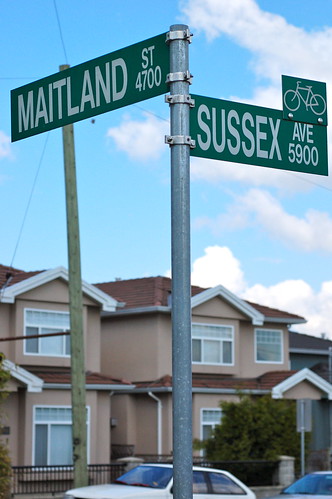
Most of the street-name signs in Burnaby, the Vancouver suburb where I live, are the standard metal stick-out-from-the-post type, like this one:
However, a couple of decades ago, just up the block from us, the city installed this one, entirely vertical in design and mounted on a girder rather than a post. And I haven't seen another like it anywhere in Greater Vancouver:
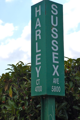
It's not genuinely bizarre—it's still white on green, and if all the signs were like that, things would work just fine. I just wonder why it's different from all the rest. (UPDATE: In the comments, visitor RentingSucks provides the explanation, which is funny, and logical.)
Across the street from those two is this masterpiece, which I still consider the most confusing road sign ever:
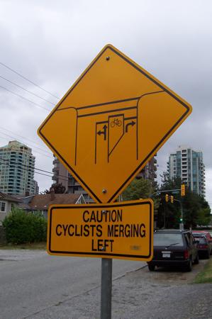
Maybe there's a secret road sign experimentation division down by Burnaby City Hall that I don't know about, and our street is its main lab.
Labels: design, signs, vancouver
Comments:


https://www.flickr.com/photos/joannabriggs/2487579228/
Incidentally, back then a house kitty-corner from mine, and about three blocks from the sign, was a biker clubhouse, so that might have been extra incentive.
Thanks for the long-awaited answer!
Site contents © 1997-2010 by Derek K. Miller, some rights reserved.