Penmachine
03 June 2009
The rise and fall of General Motors
There's a lot of talk about why General Motors slid into bankruptcy protection this week, but I think you can summarize the situation with two of the company's old cars (photos from the 2009 New York Times GM Timeline):
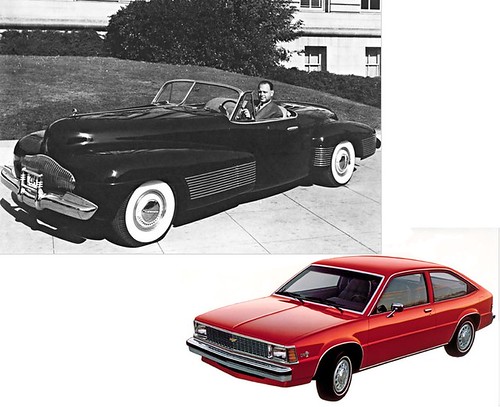
Top left, the amazing and beautiful 1938 Buick Y-Job concept car prototype (not a beautiful name, but still...), driven by GM design head Harvey J. Earl. That car appeared as the world's first concept vehicle, as GM was ascending to its all-time high U.S. market share, which reached 54% in 1954. It heralded the beginning of artistic design in automobiles, which through the 1920s had looked purely functional and utilitarian.
Bottom right, the 1980 Chevrolet Citation, a front-wheel-drive response to smaller Japanese cars from Toyota, Honda, and Datsun. The Citation was a big red hunk of meh, which drove poorly and lost sales in each of its five years on the market. The 1980s saw GM and other American car makers creating poor imitations of more successful foreign design ideas. GM was by then descending into its current state.
Labels: americas, design, money, transportation
24 April 2009
The neighbourhood of weird signs
Most of the street-name signs in Burnaby, the Vancouver suburb where I live, are the standard metal stick-out-from-the-post type, like this one:

However, a couple of decades ago, just up the block from us, the city installed this one, entirely vertical in design and mounted on a girder rather than a post. And I haven't seen another like it anywhere in Greater Vancouver:
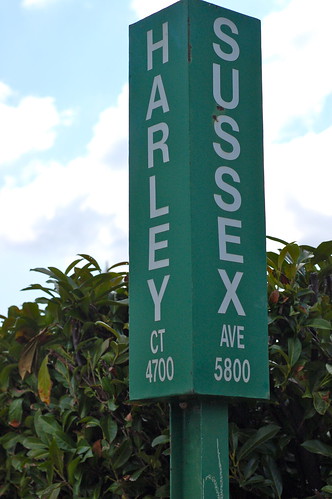
It's not genuinely bizarre—it's still white on green, and if all the signs were like that, things would work just fine. I just wonder why it's different from all the rest. (UPDATE: In the comments, visitor RentingSucks provides the explanation, which is funny, and logical.)
Across the street from those two is this masterpiece, which I still consider the most confusing road sign ever:
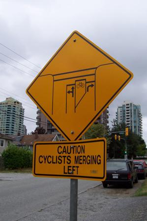
Maybe there's a secret road sign experimentation division down by Burnaby City Hall that I don't know about, and our street is its main lab.
Labels: design, signs, vancouver
15 April 2009
Links of interest (2009-04-15):
Most of these come via Jason Kottke or John Gruber:
- Nine science words that came from science fiction. See the (inevitably snipey) comments for some others, like robot, cyberspace, waldo, grok, avatar, and the delightful thagomizer.
- "I can’t think of a way that the entire [computer] desktop metaphor can be overhauled without either everyone in the world switching over at once (which won’t happen), or becoming a 'data island' like the Newton or Classic Mac OS."
- The MythBusters have a regular column in Popular Mechanics.
- "If you're married to page views, never assume that I am. If you're angling for 1,000,000 Twitter followers whom you pretend to read, never assume that I am. And, if your project is based on generating compulsory year-over-year growth vis-a-vis market domination and fiduciary responsibility, never assume that I am."
- Rush Limbaugh's 10 dumbest remarks.
- Stephen Colbert won't get a space station module named after himself, but he will get a space treadmill instead.
- Our pal Kris Krug takes great photographs of people, and is enormously prolific in publishing them online, and Miranda and Reilly Lievers make amazing wedding pictures. But when my other friend Alastair Bird, who's made his living as a photographer for many years, publishes the occasional portrait online, there's something about his shallow-focus work with a medium-format camera that I find just astounding.
- A nice summary by "Bad Astronomer" Phil Plait of Jerry Coyne's book Why Evolution is True.
- I am a photic sneezer, and it runs in my family (my grandmother did it, I think my dad does it, and one of my daughters does too). I'm glad to read an explanation.
Labels: apple, controversy, design, evolution, geekery, humour, language, mythbusters, politics, science
22 March 2009
The feel of it
 Men often obsess about our gadgets—computers, cameras, cars, fishing gear, barbecues, TVs, stereos, whatever. But too often, we get wrapped up in the stats and numbers, and forget about the feel of what we use. Not that it's unimportant, but frequently when we're researching a new purchase, we'll ignore it in favour of the specs, and only learn about the subjective experience of using the device later. Sometimes to our detriment.
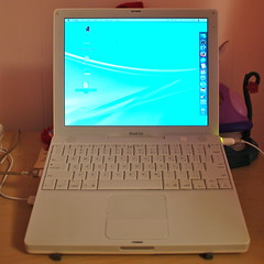
What brought this to mind was a blog post my younger daughter L, who is nine, made a couple of days ago. A few months ago my wife replaced her old laptop, so our daughter gets to use it now. (Her sister has a different desktop computer.) So L wrote:
This laptop is very special to me. I love the way the keyboard feels when I type. The way the lock opens when I ummm… open it.
I had to think, yeah. How the keyboard feels and how the lock opens are important. They're what make the laptop familiar, what define how she interacts with it, what makes it different from other technology around the house. Along with the programs she uses and the way she sets up her desktop and so on, they're what makes it hers. The speed of the processor, the size of hard drive, the amount of RAM—as long as there's enough of those things to do what she needs, they're irrelevant.
So next time you're looking at getting a new mobile phone, or a new TV, or a new camera, or whatever, take some time to figure out whether it feels right first. If you're not allowed to get it out of the package and try it, find one you can.
Labels: design, family, geekery
10 February 2009
Real cutting and pasting
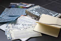 Graphic designer Michael Bierut is more than a decade older than me, but still, his article in the New York Times (via Kottke) this week felt familiar. I realized that's because, even though I've only hacked around the edges of the business of design and layout, I've been doing it for more than 30 years in some way or another.
More importantly, I belong to what is probably the last generation to straddle the gap between pre- and post-computer design. In elementary school in the 1970s, we made student newspapers with pens on Gestetner mimeograph paper, reproduced on smeary blue-inked sheets just like our notices and test papers. (More than a decade later, I had a used hand-crank Gestetner in my basement to run off newsletters for my computer club the Apple Alliance—there's some irony, or at least foreshadowing, in that.)
By the mid-1980s I was printing out long columns of dot-matrix type to cut and paste (with actual scissors and glue) onto photocopy masters, while also using Letraset rub-on letter stencils for headlines. That was for student newspapers—but putting together our high school annual still involved typewritten text, printed photos, rubber cement, and grease pencil. The real work of typography and layout was left to the professionals we never met at the printing plant in Winnipeg. We had perhaps two or three choices of typeface.
A few years later, the Science Undergraduate Society at UBC had an IBM PC clone with Ventura Publisher, and then a Mac with PageMaker. The only laser printer available was downtown, so I took floppy disks down and paid several dollars a page to print out 8x10s, which we then lined up to assemble tabloid-style layouts on blue-lined layout sheets. I drove those down to the printer to produce some of the first issues of The 432.
By the early '90s, everything was digital until the presses rolled, and a few years after that even floppies or CD-Rs were passé in favour of email and FTP. This decade I've hardly done anything for print at all: what little design work I do is for the Web, or podcasts, or maybe a PDF file that might get printed. Maybe.
So for me, a desktop, rulers, pica scales, cut and paste, cropping, and so on represent memories of the real physical activities. My kids may do some similar things for art projects, and with their grandmother when creating cards and photo books in her crafting room in Maple Ridge, but I don't expect they ever will for publication. Why would they, when we have six Macs (and two laser printers) in the house?
Labels: art, design, ego, memories, retro, school
05 December 2008
History of the mall
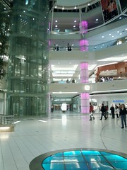 Through a chain of links from Kottke to Shopping Mall History to the Hudson's Bay Company website, I was interested to learn that two of the earliest shopping malls, West Vancouver's Park Royal and Seattle's Northgate, both opened in 1950 here in the relatively sleepy Pacific Northwest.
Even when I was a kid in the '70s, Park Royal was one of the biggest and most interesting malls in Greater Vancouver—I'd travel there quite regularly with my mother, even though it was at least a half-hour freeway drive across a bridge and there were several other shopping centres closer to us.
At that time, American TV also dominated our channel selection, so I often heard about Northgate (and its companion, Southcenter) on U.S. advertising, but I never visited until this year. (There was nothing special about Northgate except the dedicated shopping cart escalator inside Target.)
In the '80s, British Columbia's biggest mall complex, Metrotown, arose a mere ten-minute walk from our house, growing like kudzu around a Sears store that has been there for well over 50 years, and that used to be the only destination shopping in the area when I was young. On vacation, we've encountered people from the Seattle area who travel here just to shop at Metrotown, which seems weird since to me it's just our local mall.
Unlike monsters such as Mall of America or West Edmonton Mall, no shopping centre in our area has an indoor wave pool or amusement park, just lots of stores and restaurants. Yet despite decades of renovations and expansions, when you visit places like Park Royal or the Metrotown Sears or Northgate, you can see the design legacy of their origins. Something is still fundamentally 1950s about the parts that remain.
I bet some of them have time capsules still waiting to be opened.
Labels: design, history, memories, seattle, shopping, vancouver
15 November 2008
The Lions' Gate and Pattullo turn 70
According to Tod Maffin and Buzz Bishop, this week marks the 70th birthdays of both the Lions' Gate Bridge and the Pattullo Bridge here in Greater Vancouver. It would be hard for two bridges to contrast more in their appearance:
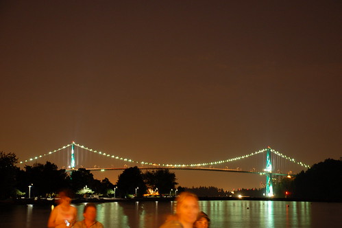
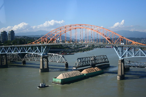
The Lions' Gate (connecting downtown Vancouver's Stanley Park with the North Shore across Burrard Inlet) is an elegant suspension bridge, lit at night with glittering lamps, and a beautiful landmark admired throughout the city and the world. It's on many of the city's postcards. It was heavily refurbished a few years ago, but looks the same as it always has.
The Pattullo (connecting New Wesminster to Surrey) is an ungainly girdered structure often cursed by those who must drive its narrow, dangerous lanes. Premier Duff Pattullo, after whom it is named, apparently called it "a thing of beauty." Tod says, "Yes, he was likely stoned." Plans are afoot to knock it down and replace it.
Labels: anniversary, architecture, birthday, design, vancouver
05 November 2008
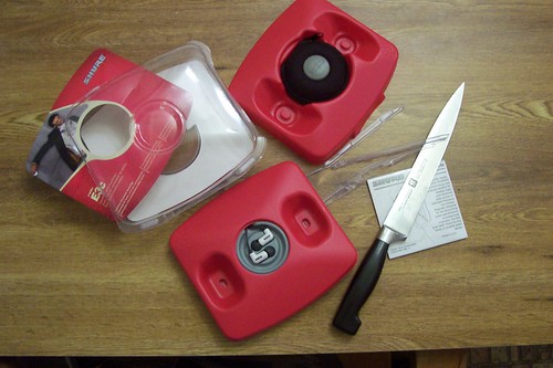
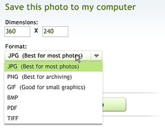
Non-killer packaging
Amazon's new frustration-free packaging (via Gruber and Kottke) is a great idea—plus I was surprised and pleased to find that Wired's coverage of the announcement includes one of my photos:
29 September 2008
New site design for Navarik
I've worked for Navarik, a company started by some of my university colleagues, since 2003. But I was involved with the the organization almost from the beginning in 2000, doing freelance writing and editing work and helping out with the website. That site has been through numerous incarnations over the past eight years, including a new version that just launched this week. Here's a comparison of what the home page has looked like over the past three generations (2004, 2006, and now 2008):
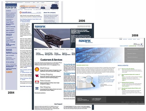
The overall feel of the site hasn't changed too radically: the blue-and-white colour scheme has been there all along. The logo, designed by Ryan in 2001, is also much the same. But the company itself has shifted its focus, so that it now describes itself as "a software service provider to the petroleum supply and trading industry." It began back in 2000 as a developer of web applications for small marine shipping agencies and shipbrokers, but now our customers include some of the largest companies in the world, such as Shell and BP.
The fine new site is much more straightforward and reflects what the company does far better than the previous one. Yet it does make me a little melancholy. I've been off work for more than a year and a half because of my cancer treatment, which means that I had nothing at all to do with this redesign, whereas I was in charge of the previous two. This relaunch is the first time I've been uninvolved for many years.
Labels: design, navarik, oil, web
26 August 2008
Old Navy's non-Olympic clothing line
I'm sure that Old Navy (being part of the Gap/Banana Republic clothing empire) has some excellent lawyers, who must have had giggled a little when they checked out, and then approved, these hoodie designs I saw for sale last week at the store:
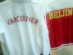
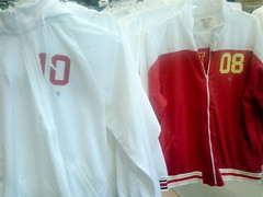
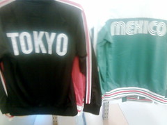
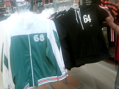
They're some reasonably funky retro Olympic track tops commemorating selected cities that have held or will hold Olympics over the past few decades (Tokyo, Mexico City, Los Angeles, Beijing, Vancouver). Except they're not, really. Old Navy is not an official Olympic sponsor or licensee. There are no Olympic logos or anything on these items of clothing, and the designers were careful to avoid even trademarked phrases, such as "Vancouver 2010."
Instead, you get a hoodie with "VANCOUVER" on the back and a simple "10" on the front, plus "BEIJING" and "08," "LOS ANGELES" and "84," "MEXICO" and "68," and "TOKYO" and "64." Simply commemorating a city and a number, see? Any Olympic association is purely coincidental, of course. I'm particularly impressed with the groovy lettering for Mexico, which cheekily apes the famous psychedelic '68 Olympics logo (scroll down at this Olympics branding site to compare). The Tokyo lettering is pretty similar too.
This might be an example of The Man thumbing his nose at The Man, but I have to admire the effort Old Navy expended to nearly, but just barely not, infringe on Olympic copyrights and trademarks. Given that, in many cases, very little of the billions of dollars that the IOC rakes in from sponsorships and licensing seems to go to the athletes themselves, I don't mind having a chuckle at it either.
Labels: clothing, controversy, copyright, design, olympics, shopping
17 August 2008
The Zune would be fun, if I didn't have to manage it from Windows
 I finally did get the Zune player working a few weeks ago, and my daughter has enjoyed using it ever since with the same set of songs, videos, photos, and podcasts I first loaded onto it. But she wanted some different stuff, so today I borrowed by dad's Windows laptop again and set about updating the little device.
What a freaking pain! Even though the Zune software was fully installed and working, somehow it had forgotten most of the subscriptions I had set up, and was still slow, scatterbrained, unintuitive, and frustrating. Getting new media on it took well over an hour, since I had to try a couple of different approaches.
I'm a Mac guy, yes, but I've been using PCs for more than 25 years, and even worked for a Windows software developer for almost five of them. Yet every time I have to install or manage something using Windows, my wife and kids know to leave me alone, because it turns me into Mr. Grumpy Boy. The Zune software only compounds the problem—somehow Microsoft, the company that makes both Windows and the Zune, can't get them to play nice with each other. At least not for me.
So I'm reinforcing my original conclusion: the Zune device is very nice, with a pleasant and useful interface. It works well once you have media on it. If some third party (or Microsoft, not likely) made a Mac client to manage it, I'd quite like the little player. But the Zune software you have to use to manage it is crap, and only runs on Windows, which for me makes it doubly crap.
Grr. Grumble. Phht. I'm glad I didn't have to pay for the thing.
Labels: design, microsoft, software, zune
19 July 2008
Continued Zune fail
UPDATE: By some miracle (and no, I don't know what I did), one last try at installing the software worked at around 12:30 p.m., and I managed to load on some video and audio, plus podcasts, onto the Zune device. I'm going to transfer a bunch of my daughter's MP3s and let her give it a spin to see what she thinks of the Zune now that it's working, more than 24 hours after I first started trying.
 It's been a few years since I used Windows regularly, but as a typical Mac fanboy I do have to ask: do those of you who run Windows regularly actually have to put up with this level of frustration all the time?
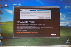
Right now I'm staring at the Zune installer program screen, telling me for the fourth or fifth time that it "Can't access Microsoft Update" (I can access it fine by going to the website, by the way). This is on the second computer I've borrowed from my dad to try to install the Zune application. Yesterday I spent something like nine hours (on and off, mostly off, thankfully) trying, repeatedly failing, and then eventually getting the Zune software to install on his older Windows XP laptop. And then, at the end of the day, while the computer itself could see that the Zune player was connected, the software never did, and I could never sync anything to be able to play it.
Having worked for a Windows software developer at one point, I have decent Windows tech-fu techniques, which I employed during yesterday's mess, even creating a new user account before the software successfully ran. Yet here I am again, needing to put the same skills to use once more the next day to get a Microsoft product working with a Microsoft operating system, because yesterday all of my ninja skills weren't good enough to get the music player to, you know, play music.
It's a pity. I like the Zune as a piece of hardware. It's cute, the packaging is nice, it seems well built, the premium headphones are really quite elegant (if bass-heavy). Yes, the Zune design team has tried way, way, way too hard to ape the iPod Nano—the one that's two generations old now, by the way—even down to the "Hello from Seattle" etched into the back in place of "Designed by Apple in California." They've made the hardware as close as they can get to an iPod without getting sued, I think.
The Zune pad that replaces the iPod scroll wheel is good, and the onscreen interface is nice indeed, smooth and useful and (for once) different. What I've seen of it, anyway: I've been unable to do anything with it, not even listen to FM radio, because the Zune (unnecessarily, I think, like the iPod too) needs to be set up from a computer first. Which is my whole problem.
If you buy an iPod, is setting up iTunes on Windows this bad? I've never done it, but I may try just to see how the experiences compare. If it is, I'm sorry, and it's a wonder that anyone ever uses a portable music player. At this point, if I'd actually paid money for the Zune, I would have returned it by now, since for the past day it has been an attractive electronic paperweight, and not a sufficiently heavy one at that.
But for now, as I've been writing this rant, I've used one of my Macs to download the full Zune installer package and move it to my dad's XP laptop using a memory stick. It seems to be installing. Perhaps by the end of this paragraph I will know if the Zune software can see the Zune player, and maybe let it play some music or videos...
Nope. "INSTALLATION FAILED. Could not write the Zune Launcher to key \SOFTWARE\Microsoft\Windows\Current Version\Run." What a lovely experience, and waste of my time.
Labels: design, fatigue, ipod, microsoft, software, zune
14 May 2008
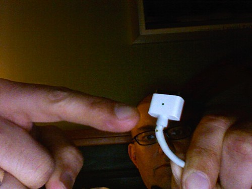
What sucks about Apple's MagSafe power adapter
It's been nearly a year since anything went wrong with my MacBook laptop, but overall, it hasn't been a paragon of reliability. The battery, motherboard, fan, DVD drive, and hard disk have all (!) needed service. Now there's this:
UPDATE: It looks like AppleCare will replace the adapter for me, no charge. I'm taking the old one in to a local Apple dealer today.
Right from when it was announced in 2006, I thought the MagSafe power connector, which pops out if you trip over the cord rather than dragging your laptop to the ground, was a smart idea. But the sharp angles and minimal strain relief of the design also seemed fragile to me, and I appear to have been right. I know several people whose MagSafe adapters have failed exactly as mine is: the cord wears through right next to the computer end of the connector.
Conversely, my wife's round iBook connector continues to work just great, even though it is a year older, and it's rare to hear of those adapters failing in a similar way at all. The new MagSafe design for the MacBook Air seems like it might be sturdier, but I don't think the actual power brick is rated for enough voltage for my bigger MacBook.
The pity is, because Apple has patented the MagSafe design and has not licensed it to other manufacturers, you can't buy yourself a third-party MagSafe-compatible power adapter with a better connector. So whether AppleCare warranty covers it or not, I'll end up with a similar flawed design, which may fail on me again in a year or two.
Labels: apple, design, macbook, repairs
09 April 2008
Flickr does video
The Neurotics Fab Rock Invasion
Originally uploaded by penmachine
The new video sharing features of the formerly photo-only site Flickr are different: the designers obviously thought a lot about how to implement video without just cloning how YouTube and everyone else does it.
The key thing is that videos uploaded to Flickr must be less than a minute and a half long, and no bigger than 150 MB. That's a limitation, but also a gift. It forces you to think about what to upload, and if you have a longer video, to edit it down to its essence.
My first video upload there is a good example. I had to take a video of my band that was already only a few minutes long and make it even shorter. I had to cut out non-licensed music and any other extraneous bits. In the end it's only one minute, but it still gets the point of our act across, even without any singing at all.
I think the time limit will generate some creativity in the Flickr community, as well as avoiding those interminable videos that take forever to get to the point. Even if a video is bad, you'll only have to waste 90 seconds on it. We'll see what happens within the well-imagined constraints.
Labels: band, design, flickr, geekery, music, neurotics, video
04 April 2008
Chevron's gas pumps piss me off
This has bothered me for years. A couple of days ago I fueled up one of our cars at a Chevron station. Here is their self-serve gas pump:
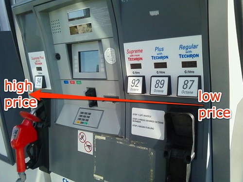
I'd like you to notice something—Chevron is trying to trick you. The lowest-priced fuel (87 octane) is on the far right. The price gets higher as you go left, with the highest-priced Supreme Plus fuel (94 octane) having its own separate nozzle, which is coloured bright red, on the far left side of the payment console. (The nozzle for the other grades is a subtle blue.)
I can think of only one reason for that, and it's one that's hostile to Chevron's customers. In a society where we read left to right, and would normally expect prices to go from low on the left to high on the right, this pump is designed to bamboozle drivers who are in a hurry and not paying close attention. In a rush, they press what they intuitively assume would be a lower-priced button (on the left), but actually get a higher-priced blend instead. That happened to me a few times when Chevron first introduced this style of pump a decade or two ago.
Worse, if you're particularly distracted, the pump for Supreme Plus can look like a separate single nozzle, and it's possible to pick the most expensive fuel without realizing it until it's too late. Up on the big price sign next to the station, we generally only see the price for the lowest-cost fuel, but the pumps themselves conspire to fool you into buying something that costs more. It's not a big thing to pay attention to if you want to avoid the ruse, but I notice a bit of a cognitive load when I encounter it. And of course, the digital price indicators have the smallest print in each section; you can hardly even see them in my photo.
Most modern economy cars—which is what most Canadians, like my family, drive—don't require anything more than the basic grade fuel. I fully expect that gas stations sell far more of that standard grade than their higher-priced varieties, so the design of pumps ideally should make it easy for the majority of people to find what they want. It might make the most sense for standard 87-octane blend to be the one with its own nozzle, and for the price to go up left to right overall. But that's not what's happening here.
Overall, Chevron is no more or less controversial than other oil companies. I like their claymation commercials and their Town Pantry convenience stores. But because of this pump design problem, I usually don't buy my gas at their stations.
Labels: chevron, controversy, design, money, oil
07 February 2008
Free sort-of open source web designs
UPDATE: Lloyd Budd points out that these are not really open source.
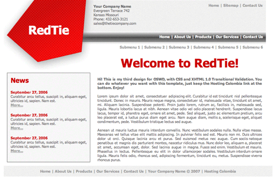 OSWD is a bunch of open-source web designs, most of a bloggy style. There are more than 2000 of them so far, and you can contribute your own—at least if you have better web design skills than I do.
Thanks to Bre for the link. Here's a nice example, called RedTie.
(P.S. If you click on the image you'll see what it looks like now that I'm trying out Cabel Sasser's very slick FancyZoom web design JavaScript.)
Labels: design, free, geekery, opensource, web
28 January 2008
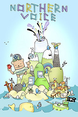
Help design this year's Northern Voice poster
 Vancouver artist Basco5 is once again designing the fabulous poster for the upcoming fourth annual Northern Voice blogging and social media conference here in town. (Last year the organizers were kind enough to give me one of Basco5's big 2007 posters, which now hangs in our bedroom.)
This year, Basco5 and the NV crew would like your input to help design the poster, so head on over to Flickr and leave a comment if you have ideas or suggestions.
I already like this year's tiki text/"squishy volcano" look.
Labels: art, conferences, design, flickr, northernvoice
05 December 2007
Speaking of photo geekery...
 As of this morning, everybody favourite photo website, Flickr, has just teamed up with Picnik to let you edit your photos inside Flickr. That's big news.
This is an especially important development (ahem) for the growing number of devices, from Wi-Fi enabled cameras and memory cards to mobile phones and beyond, that can send photos directly to Flickr without a computer intermediary. Until now in those cases, you could only use what limited retouching and editing capabilities were built into your device—if any—before your photos went online.
Now you can use an elegant and very Flickriffic interface to make lots of changes to your pictures (modify exposure and colours, remove red-eye, crop, etc.) from anywhere with any web browser, after you've posted them. Free.
Very slick. Picnik also offers Picnik Premium for $25 a year (the same cost as a Flickr Pro account), if you want more effects and editing capabilities. The free and premium services also work with other photo sites, by the way—today just adds an Edit Photo button right within Flickr.
Labels: design, flickr, photography, web
20 November 2007
iPod Touch: my first impressions and review
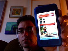 Since I'm on medical leave from work and am sitting at home feeling slightly barfy, I've had a fair bit of time to try out the iPod Touch I received yesterday. My summary: like its sibling the iPhone, it is a fantastic little portable computer. For video, enhanced podcasts with artwork, listening in the car, web browsing, and reading text, it's fabulous. However, as a pure portable music player, I think the other iPods are superior. Here's why.
I miss the click wheel
The iPod Touch and iPhone lack the classic iPod click wheel, or even the round switch arrangement of the iPod Shuffle. The Touch and iPhone screens are big, beautiful, touch-sensitive blank slates—which makes them impossible to use if you can't see them. So when my iPod Touch is in my pocket, I can't skip songs, change the volume, scrub through a podcast, or even pause a track without taking it out to look at it. When I'm on the go, it's therefore slower and more awkward to use than my 5G iPod.
Yes, if you have an iPhone (not yet available in Canada), the headphones include a simple remote to address some of those problems; on the iPod Touch, you need to buy a third-party remote, which I'm seriously considering. Even then, you have only rudimentary, iPod Shuffle–like control over your player.
The click wheel is one of the great genius pieces of design in Apple's iPod lineup, a patented, distinctive component of the iPod's success since 2001. It's brave of the company to ditch it entirely on these new flagship models, in favour of the remarkable new "pinch, tap, and flick" multi-touch interface. But when you're used to the familiar thumb-spinning action of the click wheel, having to hunt for onscreen sliders and scrubbers and virtual buttons is, simply, a chore.
Good for music, great for much else, destined to get better
Don't think that I dislike the iPod Touch. When I use it, it feels like a piece of the future in my hand. I'm hugely looking forward to Apple's promised software development kit (SDK), coming in February, after which programmers everywhere will be able to create all sorts of amazing applications for it, from document readers and word processors to games and screen savers—on top of the already impressive selection of web apps out there. Right now we're limited to the programs Apple ships on it, which are interesting but few.
Because it is a more general-purpose device than other iPods, I find there's more tapping and menu navigating on the Touch, because it does more, but that makes it a little slower to use for most tasks. Some features I've become used to with other iPods, such as using my Belkin audio recorder or setting up the device as a USB flash drive, are unfortunately gone too. Like most iPods, it also feels rather fragile on its own, so I picked up a silicone case and screen protector today from Westworld, seemingly the only retailer in Vancouver with any iPod Touch accessories at all so far.
Compared to the iPhone, it has no camera, speaker/mic, physical volume switch (argh!), headphones with mini-remote, or certain built-in applications (local client email, Google Maps, etc.)—so you have to use them via the Web. The colour scheme is a bit different too. The front bezel is dark, and the back is the usual smudge-o-licious iPod chrome, rather than the flat metal of the iPhone.
It does have a YouTube app and, best of all, Apple's Safari browser. Most websites work perfectly, and the ability to zoom, rotate, and manipulate the display makes everything from using Gmail or WordPress or Blogger to reading blogs and news sites simple and surprisingly pleasant for such a small screen. The onscreen keyboard doesn't beat something real to type on, but particularly in landscape mode it works tolerably with my largish fingers. (Someone who builds an external keyboard for this thing will sell quite a few.)
I think it would make a great e-book reader, but right now there is no easy way I know of to load up text or PDF documents for reading. The Touch can display PDFs and text files from the Web very well (though I wish text files would word-wrap more neatly), but unless you want to set up your own web server (not hard for webby geeks like me) or email yourself a book (feasible but awkward), we'll have to wait for the SDK before that's easy.
Early in the revolution
The multi-touch interface is a revolution, though an early stage one. My fingers are finding themselves a bit confused. I still instinctively try the circular motion of the click wheel when wanting to adjust the volume, pause, or change tracks.
And when I get back to my MacBook laptop, I'm really flummoxed, because there I can scroll with two fingers on the trackpad too. But the scrolling direction is (quite logically, but still contradictorily) completely the opposite of the flicking motion on the Touch. On the MacBook, to scroll a page down I put two fingers on the pad and drag them down; on the Touch, I use one finger on the screen and flick the page up. The transition is like switching between two languages you're fluent in—it takes a bit of time for your brain to make the change.
The cool factor of the iPod Touch is certainly hard to beat. The screen is super-sharp, and photos and video look just great on it. The Touch also works perfectly with my car FM adapter, and in that context it's better than the old iPod because you can see the screen better—but I had to turn the brightness down when I tried it last night, because it was like a searchlight compared to the dashboard instruments!
A device unsure of itself
When the iPhone first came out, many people wanted one without the phone part. The iPod Touch is pretty close, but that also makes it a device that isn't quite sure what it wants to be. Is it a portable computer? A music player? A video device? A web appliance? Well, yes and not quite. Apple positions it and the iPhone as their top-of-the-line models, but if you listen to a lot of audio, or need to record, or like to store data too, think carefully. The massive storage and reliable old click wheel of the iPod Classic or the miniscule convenience of the iPod Nano might work better for you.
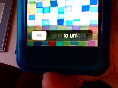
Despite that, I suspect that I'll be carrying and listening to the iPod Touch a lot more than my old 5G iPod. When I wake the screen from sleep and slide the virtual switch to unlock it, or flip the iPod sideways and watch the screen display flip too, or grab a chunk of web page and move my fingers to zoom it, or flick a list of podcasts and observe the carefully-calibrated ballistics of how the list decelerates to a stop, there's something amazing about that experience. It's a new kind of computer in my pocket.
A few niggles here and there don't negate the amazement. And I get the feeling that once it's no longer amazing, that experience will simply be something I expect, and almost everything else will seem old-fashioned.
Labels: apple, design, gadgets, geekery, ipod, macosx, music, video
10 November 2007
Software update hell
Microsoft has been diligent in releasing updates to its Office 2004 suite for Mac, largely to address security vulnerabilities. That's good. But their updater software sucks. Here's why:
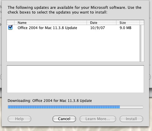
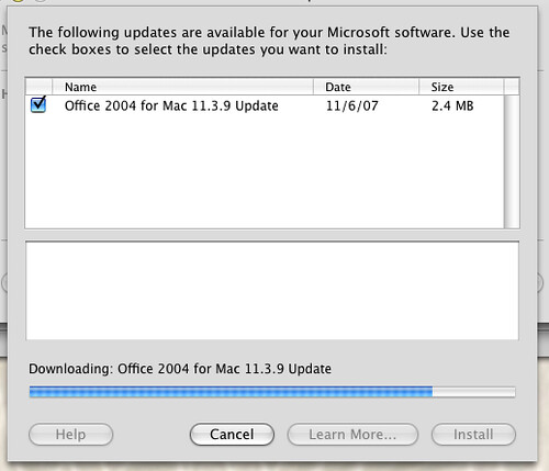
The latest update is version 11.3.9. It turns out that I hadn't updated since 11.3.4 or thereabouts. Now, you'd think that the 11.3.9 update would update any version of Office to the latest version. Nope, here's what I had to install today:

If you look at those screenshots above, you'll notice that only one update appears in Microsoft's AutoUpdate software at a time. That's right, I had to run the updater, apply the version 11.3.5 patch, quit that, run the updater, apply the 11.3.6 patch, quit that... and so on.
I fear to think how long it would take if I had to reinstall from my original-release Office 2004 (11.0.0, I guess) disc. I suppose I should be glad I didn't have to reboot each time!
UPDATE: I forgot to link to my previous rant from last year about the even worse procedure I went through with Adobe Reader.
Labels: design, macosx, microsoft, software
29 October 2007
The only Mac OS X Leopard review
If you look at no other material (not even Apple's own web pages) about the latest version of the Macintosh operating system, Mac OS X 10.5 "Leopard," which came out on Friday, then read John Siracusa's 17-page in-depth review. It tells you everything you need to know and more, just like the ones he's written for every previous version of Mac OS X going back seven years.
UPDATE: I should have made it clear beyond my geekery tag that this is a Mac OS review only for a certain type of user, of which I am one. To quote:
While the casual Mac user [i.e. normal people - D.] will gauge Leopard's worth by reading about the marquee features or watching a guided tour movie at Apple's web site, those of us with an unhealthy obsession with operating systems will be trolling through the internals to see what's really changed.
I fully count myself among those with an "unhealthy obsession with operating systems"—people like this guy. Hell, I laughed out loud in public at a joke about font rendering (!) in the command-line Terminal (!!). In the chemotherapy lounge at the B.C. Cancer Agency, even (!!!). If that doesn't seem out of line to you, saddle on up.
Labels: apple, design, geekery, macosx
24 October 2007
Links of interest (2007-10-23):
- Speaking of the whole Dumbledore thing, here's a funny list: "Gay marriage will encourage people to be gay, in the same way that hanging around tall people will make you tall."
- "What is it about the world of enterprise software that routinely produces such inelegant user experiences?" One explanation: "'Enterprise software' is software that has to be sold to an 'enterprise', where someone who doesn't use the software (typically a manager) must be persuaded to use his purchasing authority to buy the software."
- Secrets that airlines don't want you to know (nothing too earth-shattering).
- 25 awesome action heroes.
- "Power users are a minority, and while they point the way to the future, they tend to be disappointed when the rest of the market catches up with an inferior product that has a lower barrier to new users."
- Gmail is finally getting IMAP support. If POP-only support frustrated you until now, you'll find that useful.
- "If it happened under Bush, Iran-Contra wouldn't even make Page A-18."
Labels: books, design, gmail, government, linksofinterest, movie, travel
20 October 2007
Look and feel
I like what the Mozilla Foundation developers are doing with the user interface for the upcoming Firefox version 3 web browser: matching the interface elements to the operating system:
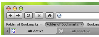
While Firefox looks good now...
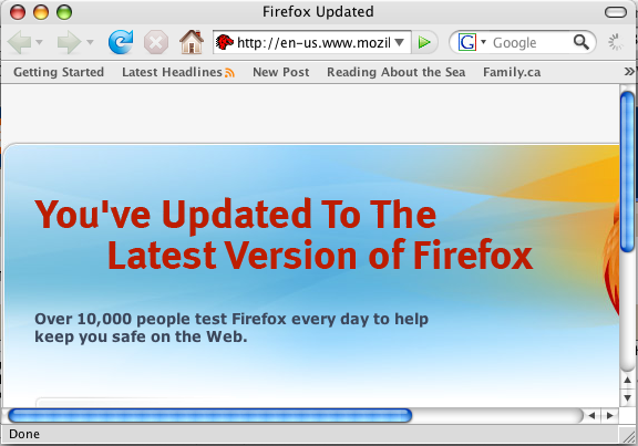
...sharing a general appearance with other applications in Windows or the Mac OS will make it a better experience, and I think it's a good investment of developer time.
Labels: apple, design, firefox, macosx, microsoft, software, web, windows, windowsvista, windowsxp
15 June 2007
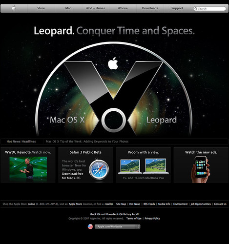
Apple's website redesign, sort of
Apple doesn't redesign its website in a fundamental way very often—the basic buttons and arrangement of apple.com has been much the same for at least six years. But recently Apple re-did the whole thing. Sort of. Apple.com has the makeover...
...but sites outside the U.S.A., such as apple.ca, still have the old look...
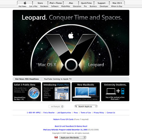
Previously I had thought that Apple's web infrastructure ran all their sites, and that a redesign would change them all at once. Guess not.
Labels: apple, design, redesign
11 June 2007
Safari for Windows
While there was neat information about Apple's new Mac OS X 10.5 "Leopard" operating system, coming in October, there wasn't all that much amazing or unexpected during the company's keynote presentation about it today. No new computers or iPods, for instance.
What was unexpected is the new beta of the Safari browser, which is suddenly available not only for the Mac, but also for Windows XP and Vista for the first time.
UPDATE: Macworld discusses some key features of the new browser. The new Find command is awesome—finally I'm no longer hunting for the result in a sea of text. That and the draggable/tear-offable tabs are worth the upgrade in themselves.
Labels: apple, browser, design, macosx, safari, windows, windowsvista, windowsxp
04 May 2007
Type B guy with some Type A website compulsions
I'm a pretty Type B guy in most circumstances—just ask my wife. But when it comes to web pages and certain other technical things, I have some compulsions. One is trying to keep the HTML code valid. That's not always possible for a variety of reasons (hmm, maybe I'm not quite so compulsive after all), but I do try.
Thus, I spent the past two hours wrestling with my new page template here to try to get it to validate to the XHTML 1.0 Transitional specification. Pretty much no one who visited during that time would have noticed any changes, but it turns out that a lot of Blogger's clever automated code for comments, backlinks, and in-place editing of blog posts won't validate, no matter what you do.
So I got rid of most of it, which makes editing this blog slightly more work, but not enough for me to justify keeping the code permanently invalid. I did find one slightly clever way of making sure the comments still work, but backlinks and edit buttons and stuff are gone.I won't miss them.
Even so, on the individual post pages, where comments appear, I can't get the page to validate at all because of Blogger's semi-crappy code, not all of which I want remove. I'll have to go for Type B on that. Now, time to down my chemo pills and head for radiation treatment again. There's a real problem to deal with.
Labels: design, geekery, php, redesign, relaunch, xhtml
03 May 2007
Hacking around my Apache PHP problem
I've had a problem getting this new blog template to work the way I want, but I have largely solved it. Or, more accurately, I've hacked around it. I had been hoping for a more elegant solution, but in the end I simply went back to Blogger's conditional template tags for my individual blog post pages.
That actually imposes less of a load on my server, since Blogger generates those pages as static HTML instead of doing all the PHP rendering stuff on the fly, and I can easily make (and have now made) the sidebar different for the different views of my posts. On the other hand, the PHP is simpler to work with because I would only have to edit the include files, instead of the main template, when I want to make changes. I'm keeping the PHP sidebar and footer for the home page, monthly archives, and for other pages as I deploy the new design around this site.
As I said, it's a hack. Still, as a total non-programmer, I'm not too disheartened. Even Dave Winer, who's been blogging longer than pretty much anyone—and helped invent most of the stuff that makes blogs what they are—writes:
I think we must all go through this rite of passage, the docs for Apache are so cryptic and inadequate. The design of Apache itself is weak. But it is workable, you know that eventually you'll puzzle it out...
I puzzled out a solution. That's no surprise. After that, the server is "a patchy" piece of software to start with.
Dave also has some good followup about why the "community of hooligans" (in Don Park's words) at Digg got so cheesed off the other day about a string of numbers.
Labels: aacs, bluray, censorship, design, digg, encryption, geekery, hddvd, key, php, redesign, relaunch
02 May 2007
How do I get Apache to treat URLs with no file extension as PHP?
Feel free to ignore this if you're not a web development type. If you are, it should be a simple question, but I don't know the answer.
I'm re-doing this website, as you've seen, and I'm using some PHP includes. On pages that end with a .php extension (instead of .html or something else), that works great. It's why you see the navigation sidebar and the footer at the bottom of the page on the home page and monthly archives (they're really only single files that get sucked into each page as it loads):
http://www.penmachine.com/index.php
http://www.penmachine.com/old/2007_05_01_.php
But for some reason, Blogger is generating individual post pages without extensions, like this:
http://www.penmachine.com/2007/05/dont-cheese-off-geeks
http://www.penmachine.com/labels/encryption
By default, the Apache web server software I'm using treats these files as plain text (showing all the code gobbledegook), but I want them to be treated as PHP, so I tried editing the .htaccess file thus:
DefaultType application/x-httpd-php
But that creates a 500 Server Error. Strangely, this works:
DefaultType text/html
So you see the pages above properly as HTML web pages, but of course they don't have the sidebar includes, because Apache doesn't know they're supposed to be PHP.
What am I doing wrong? Is there a better way to approach this problem? All I want is for Apache to say, "Ah, a URL with no file extension—that's PHP," then the rest should Just Work, as it does for files ending in .php.
Suggestions?
Labels: design, geekery, php, redesign, relaunch
01 May 2007
Blankly slatey
Don't panic. I said a few weeks ago that I was going to redesign this blog, and right now what you see is an extremely minimalist beginning. It will change, and get nicer and prettier and all that.
Also, all the old stuff, right back to the year 2000 and earlier, is still here. I'm just starting at the beginning of May with a blank slate, which I'll play with and you can watch as I add to it.
And yes, I still have the cancer. No restarting that!
Labels: cancer, design, redesign, relaunch