
About
Words, music, comment, notes, news, and updates since 1997 from Derek K. Miller, a writer, editor, web guy, drummer, and dad who's a blogger in Vancouver, Canada.
Recently
Penmachine
04 April 2008
Chevron's gas pumps piss me off
This has bothered me for years. A couple of days ago I fueled up one of our cars at a Chevron station. Here is their self-serve gas pump:
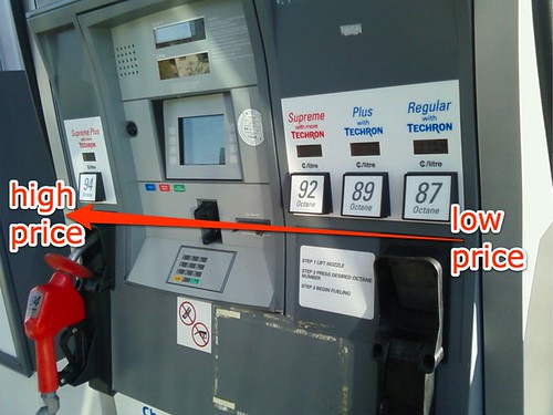
I'd like you to notice something—Chevron is trying to trick you. The lowest-priced fuel (87 octane) is on the far right. The price gets higher as you go left, with the highest-priced Supreme Plus fuel (94 octane) having its own separate nozzle, which is coloured bright red, on the far left side of the payment console. (The nozzle for the other grades is a subtle blue.)
I can think of only one reason for that, and it's one that's hostile to Chevron's customers. In a society where we read left to right, and would normally expect prices to go from low on the left to high on the right, this pump is designed to bamboozle drivers who are in a hurry and not paying close attention. In a rush, they press what they intuitively assume would be a lower-priced button (on the left), but actually get a higher-priced blend instead. That happened to me a few times when Chevron first introduced this style of pump a decade or two ago.
Worse, if you're particularly distracted, the pump for Supreme Plus can look like a separate single nozzle, and it's possible to pick the most expensive fuel without realizing it until it's too late. Up on the big price sign next to the station, we generally only see the price for the lowest-cost fuel, but the pumps themselves conspire to fool you into buying something that costs more. It's not a big thing to pay attention to if you want to avoid the ruse, but I notice a bit of a cognitive load when I encounter it. And of course, the digital price indicators have the smallest print in each section; you can hardly even see them in my photo.
Most modern economy cars—which is what most Canadians, like my family, drive—don't require anything more than the basic grade fuel. I fully expect that gas stations sell far more of that standard grade than their higher-priced varieties, so the design of pumps ideally should make it easy for the majority of people to find what they want. It might make the most sense for standard 87-octane blend to be the one with its own nozzle, and for the price to go up left to right overall. But that's not what's happening here.
Overall, Chevron is no more or less controversial than other oil companies. I like their claymation commercials and their Town Pantry convenience stores. But because of this pump design problem, I usually don't buy my gas at their stations.
Labels: chevron, controversy, design, money, oil
Comments:
I've been caught by this the odd time but I usually pay attention if I am at a station I don't normally buy from.

Just another sneaky trick to gouge customers who aren't paying attention.
 : 04 April, 2008 11:55
For that matter, is the difference of refining cost between grades actually significant at all in the overall cost of extracting, storing, transporting, and selling the fuel? It may be, but it does make you wonder...
However, I also walk the opposite direction of expensive items in London Drugs. So perhaps I am just odd when it comes to shopping.
: 05 April, 2008 10:41The gas pumps do cause people to spend more than they planned to, at least occasionally. It's happened to me, and I don't think most people who know me would consider me naive or dumb. Once I had it happen a couple of times, I did two things: (a) I paid more attention, (b) I avoided Chevron most of the time.
Indeed, so is it when grocery stores put all the commonly needed, lower profit items (milk, meat, etc.) at the farthest reaches of the edges of the store, with the higher profit impulse items on the way, or featured. Unfortunately in that case, pretty much all grocery stores do it, so we as customers have little choice. And few people are aware of that design either.
I've worked in both marketing and interface design. One principle of good UI design is, as Steve Krug writes, "Don't make me think!" That's not because people shouldn't think, but because it's better if they apply their brains to important things, rather than on unnecessary obstacles to doing what they want to do. Marketing often has to oppose that in order to try to make more money. As customers, we should be aware of that, so we can make choices against it if we wish.
: 07 April, 2008 08:52 : 09 July, 2008 08:34
Site contents © 1997-2010 by Derek K. Miller, some rights reserved.