


Information design on websites and ships
Permalinks to this entry: individual page or in monthly context. For more material from my journal, visit my home page or the archive.
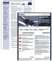 Over at my work, Navarik, we've launched a new website—the first significant update to the design in nearly two years, since Dave Shea designed the last one for us while he was our Creative Director in 2004. Back then I wrote a series of fairly long pieces (parts 1, 2, and 3) about how we did that.
In this case, the process was quite different, with me defining the site structure well in advance in a big diagram, in consultation with other people in the company. Our vastly talented co-op student Andy turned that structure into actual web pages on a staging web server. Then he and our lead designer Darren created a layout and design which they then constructed in XHTML and CSS. Andy also imported, converted, and reformatted the old weblog posts from our ancient Movable Type install to WordPress.
For the content, I either ported over existing material from our current website or wrote new stuff from scratch, with the assistance of Navarik's co-founder Bill and our marketing guy Tomo. Of course there was more new material than I was expecting, and Darren and Andy were shifted to another project which required a bunch of extra people, so I was left to complete the site pretty much on my own. Which was stressful, and led to a bunch of things being put off until after the launch, rather than being there from the start, but the crunch to finish it was actually a whole lot of fun. We put the new site online three days ago, March 28.
Then two days ago, March 29, a bunch of us from the office traveled to Neptune Bulk Terminals in North Vancouver to visit the potash transshipment facility used by one of Navarik's clients, Canpotex. It is a massive operation, where tens of thousands of tons of mineral dirt, mined deep underground in Saskatchewan in the middle of the continent and then brought to the coast on trains hundreds of cars long, are transferred along myriad conveyor belts through two huge storage sheds or onto ships docked in Burrard Inlet. That potash then goes to South America, Asia, and elsewhere by sea to be turned into fertilizer or LCD panels.
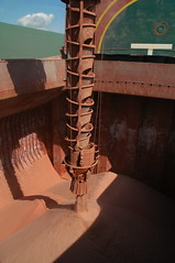 Navarik has developed, and runs and maintains, software to help Canpotex coordinate the business of shipping the potash. So we got to go onboard a ship, the delightfully named and spotlessly maintained Frontier Angel, which is registered in Panama but crewed by Koreans, and was taking about a day and half to load 50,000 tons of potash. This monstrous, massive machine was docked alongside other monstrous, massive machines in order to transfer these huge quantities of stuff from shore to vessel.
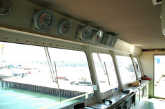
After days and weeks with my head deep in the structure, content, design, layout, and information architecture of a website, I was struck by the information design aboard that ship. On an oceangoing bulk carrier like the Angel, the usability and usefulness of onboard systems are life-and-death matters: for the captain and crew, knowing the locations of things, the values of readings, and the position and movements of the vessel and its surroundings is critical to their survival, whether when loading cargoes in North Van or traveling through a brutal sea in driving nighttime storms thousands of kilometres from land.
So the information design is often brutally clear. The bridge, for instance, is a sparse place, with clean, empty floors, a steering wheel like a Honda, and everything that could move lashed or bolted down to withstand a pitching sea. When at the wheel, the captain or pilot can look above the large windows and see something much akin to a car dashboard: large, easy-to-read gauges that show the angle of the rudder, the speed and direction of the wind, and so on.
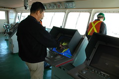
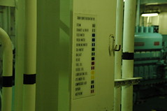
Cabinets and control panels are starkly and clearly labeled (if you know the jargon) and coloured. The two redundant radar installations have large, high-contrast displays with dedicated, highly tactile buttons and controls beneath:
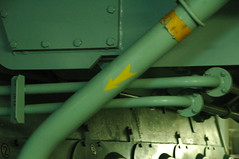
Down in the engine room we saw the clearest example. It was a legend mounted in several different places, indicating what the colours and patterns painted on the various pipes and conduits mean. With it, even someone like me, who'd never been in the engine room of a cargo ship before, could tell that certain pipes were carrying lubricating oil, while others transported seawater:
On the way out the door, we spotted a readout showing the temperatures of the various food storage areas on the ship. Again, very clear and easy to understand. I wish our fridge had that—but then again, if food goes bad in our fridge, we throw it out and buy more at the supermarket. For these guys, the nearest supermarket might be 3000 km away over open ocean.
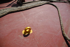
Last were more physical pieces of information design, in the form of yellow paint. The steel tie loops protruding from the deck are bright yellow against the red of their surroundings, so you can see them even in your peripheral vision and avoid tripping or stubbing your toe on them. (My coworker Nathan, a former shipping agent, reports that the yellow doesn't help much at night in the rain.) Other deck features are similarly marked.

Software and interface designers can take inspiration—even if not direct lessons—from the clarity, purpose, usability, and effectiveness of all those elements of the ship's physical and information design. Here's one more. A ship's IMO (International Maritime Organization) number is like a serial number, or the VIN number on your car, uniquely identifying that vessel no matter whether it is renamed, repainted, or rebuilt. On the Frontier Angel,, it appears in many places, including a plaque on the bridge, above the windows and just to the left of all those gauges.
But the place where it's most obvious is in the engine room, where it is cast in characters nearly a foot high on a plate welded permanently to the front wall:
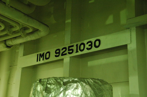
So even hundreds of years in the future, after the vessel has run its life and been disassembled for scrap, maybe that piece of metal will survive, and the number will still be there, so that archeaologists coming across it, rusting in some forgotten ruin of a warehouse, can find out which ship it had been.